To create an appealing dental website that potential patients will enjoy is difficult. A canned or template website sometimes just isn't enough to stand out among the competition and encourage patients to choose you.
Below, we highlight 10 dental website designs to both inspire and help make your site more appealing to potential patients. We break down the top features of each site. That way, you find opportunities to copy their best practices and apply them to your project.
Quick disclaimer. Just because we don't list certain best practices doesn't mean that the website isn't incorporating them. Many of the dental websites below absolutely nail it on multiple fronts when it comes to best practices for a website in their industry.
It's safe to say you can learn from all of them. Let's begin.
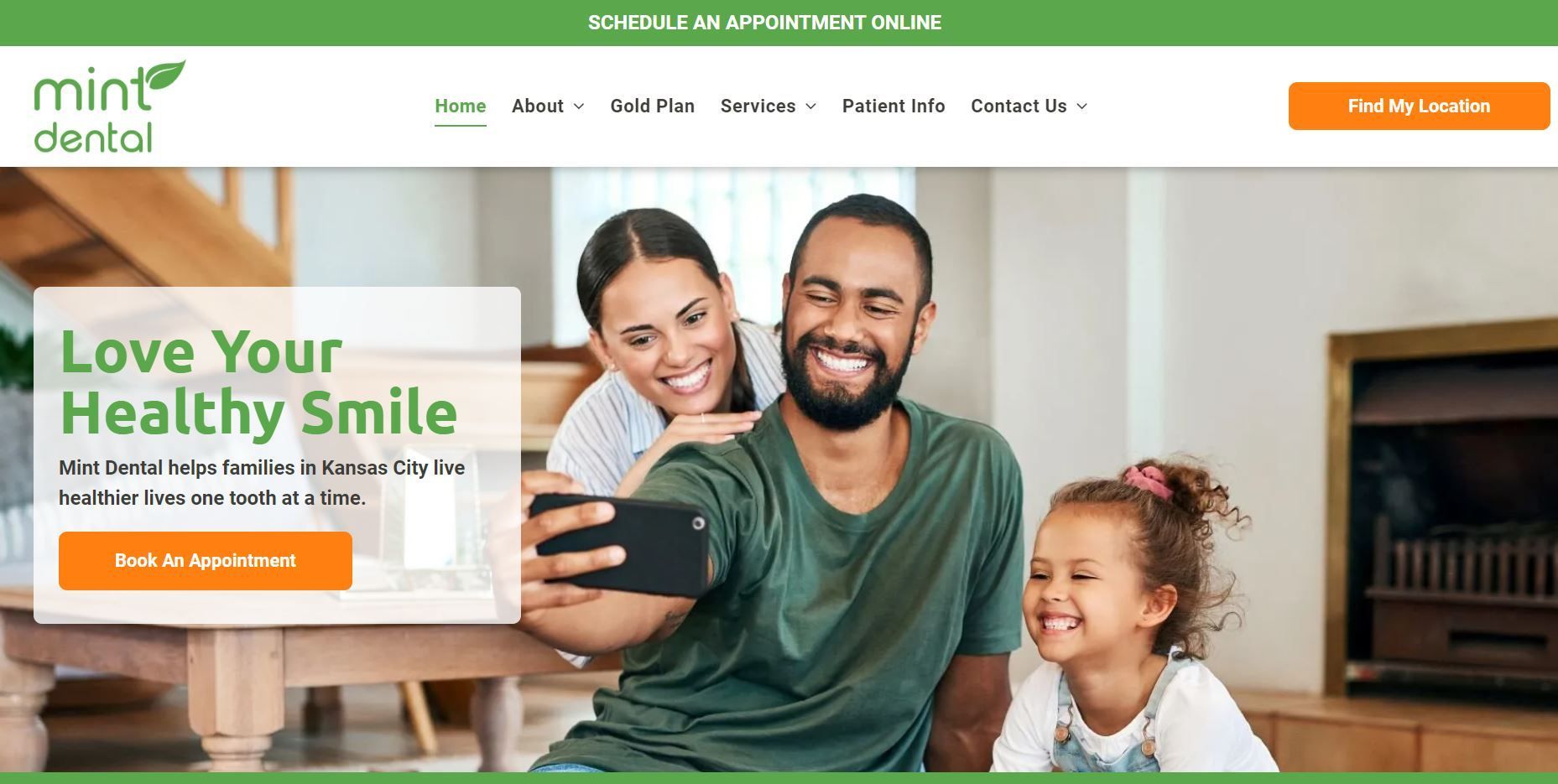
1. Mint Dental
A great first impression is key for a dental website to convert visitors into customers—Mint Dental has nailed that. The high-quality photos of happy, bright smiles on the homepage will undoubtedly grab website visitors' attention.
The homepage has all the must-haves to be fully effective:
- Visually compelling photos that tell a story without distracting visitors
- The simple navigation bar helps visitors access information quickly
- Sufficient use of white spaces to improve the user's visual experience
- Clear call to action (CTA) to encourage visitors to take action
The clean design invites people to learn more about the brand. A web visitor can quickly identify dental services offered and the brand's locations. Most importantly, a button to schedule an appointment floats at the top of the page for easy reach, regardless of where you are on the website.
Best practice:
- Use relevant, high-quality photos showing healthy teeth and smiles
- Make it easy to access different sections of your website
- Use clear, action-oriented CTA
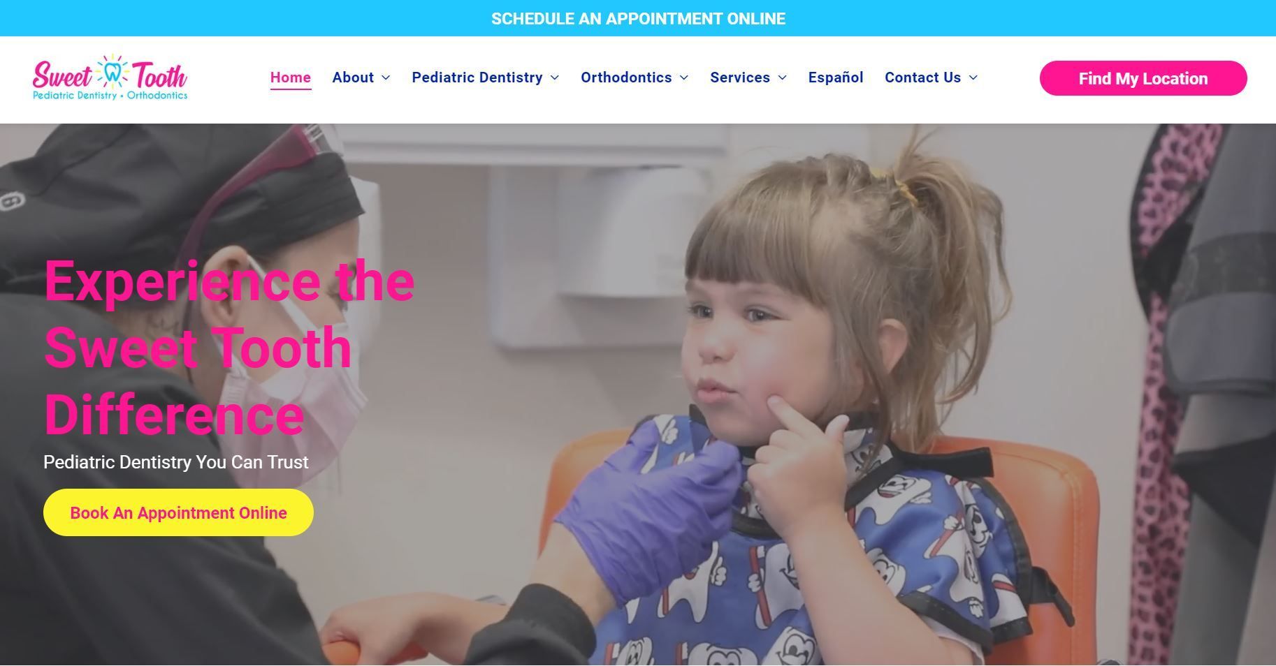
2. Sweet Tooth Pediatric Dentistry
How does a dental website make a strong first impression? Sweet Tooth uses an amazing video illustrating the brand's unique approach.
The poppy color scheme on the website isn't simply for visual appeal but also consistent with the brand color. A signature color can help your brand stand out in the industry.
What makes the website's design a success is how users can easily explore the company's offerings. The menu at the top and navigation anchors at the bottom allow visitors to jump easily to specific sections.
And no matter the device you use (mobile or desktop), the web design is very responsive to ensure the site's content fits perfectly on different screen sizes. Responsiveness influences how Google ranks your dental website.
Best practice:
- Use video on your website to showcase your practice's experience
- Make your website's colors consistent with your brand colors
- Use responsive web designs (mobile-friendly designs)
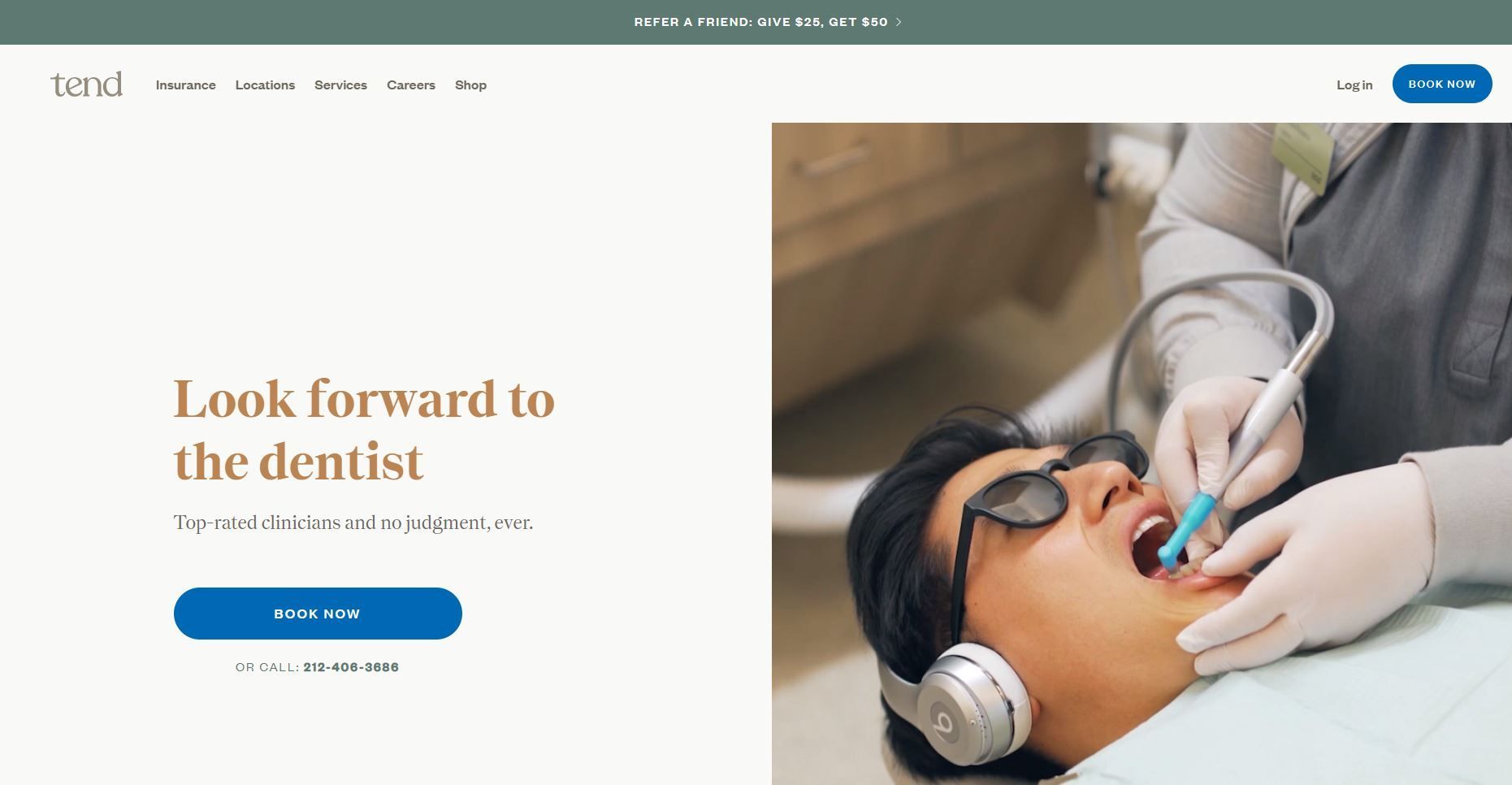
3. Tend
Tend has all the strongholds of a successful dentist website, from great visual appeal to responsiveness and simplicity.
Tend uses video in a different way. Their video is from the perspective of an ideal patient going through their full day, including visiting Tend. The navigation bar at the top shows the brand's full services and locations.
Visually compelling photos and easy-to-read web copy blend perfectly with the site's simple design, from the selection of photos to how they are edited to fit the color scheme. CTA buttons are strategically placed and action-oriented to inspire web visitors to book appointments.
Best practice:
- Make your copy easy to read
- Combine copy with appropriately edited photos for a great visual appeal
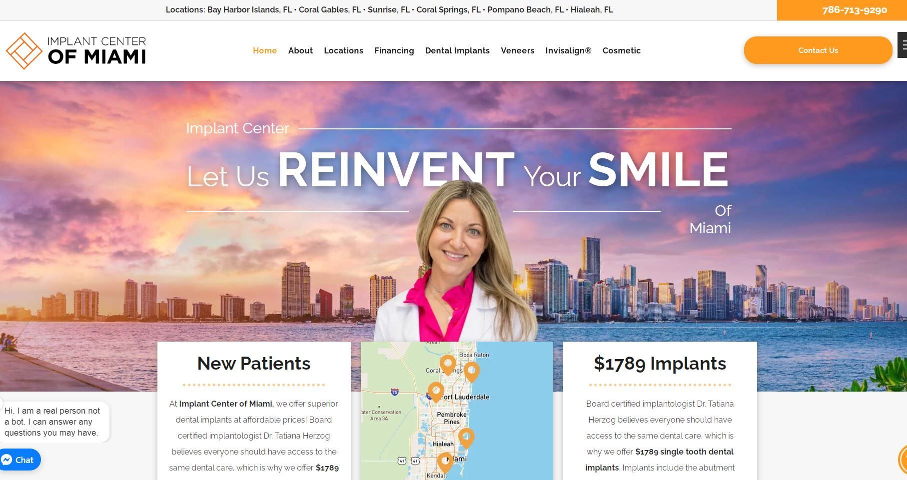
4. Implant Center of Miami
Implant Center of Miami appears on this list of top 10 dental websites for a good reason: easy-to-navigate web design and relevant information available right away.
This website is utilizing it's hero (the first thing you see on a web page) to get across as much relevant information as possible.
There are no shortage of call to actions and invitations to explore the rest of the website and its rich content. From the videos on the front page to the welcoming images of the doctors, the design and content blend well for a very inviting and engaging website experience.
This website is top quality and waste little time getting the visitor to engage in some way.
Best practice:
- Utilize the hero on a website to convey extremely relevant information
- Use plugins such as live chat and accessibility widgets
- Include pricing on your website
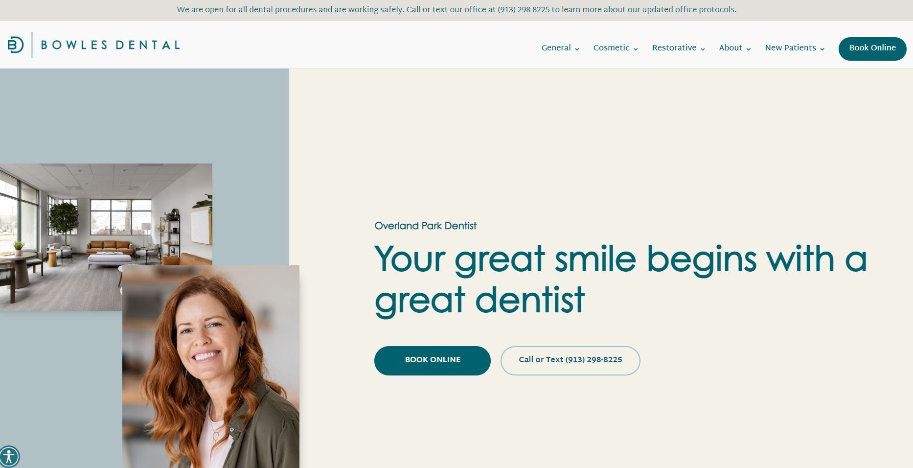
5. Bowles Dental
Bowles Dental wows patients with a modern, engaging web design. Several things make their dental website a success.
First, there are multiple ways for patients to make an appointment: calling, texting, or booking online. Your dental website should make it easy for visitors to book an appointment in the way that is most convenient for them.
Second, the copy is patient-centered; it answers typical patient questions that usually delay booking appointments or tie up time on the phone. Visitors can easily understand why they should become Bowles Dental's patients instead of the competitors.
The photos contribute to a fantastic visual appeal and compliment the design near perfectly. The expectation of a beautiful smile people would get from booking an appointment is clearly evident.
Best practice:
- Be very customer oriented with your website copy to reduce anxiety
- Answer common questions on your pages
- Ensure web visitors have multiple options for booking an appointment and can easily see where to get started
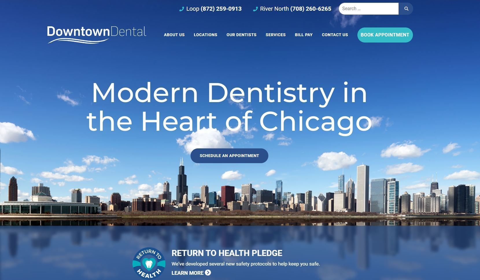
6. Downtown Dental
Downtown Dental web design clearly emphasizes the fact that they are located in Chicago. From the name to the prominently featured image, the website's professional look instantly suggests that they are one of Chicago's best.
Here's how Downtown Dental's website streamlines the user experience and builds authority:
- Very quick loading times
- Clear information regarding their locations and the available services at each
- High quality design that's both professional yet simple
- Consistency between pages, including featured testimonials and an easy booking widget
Best practice:
- Use imagery that is highly relevant to your location
- Don't waste the user's time with information that doesn't pertain to their intent
- Improve your page load time to streamline the customer experience
- Keep your service pages consistent
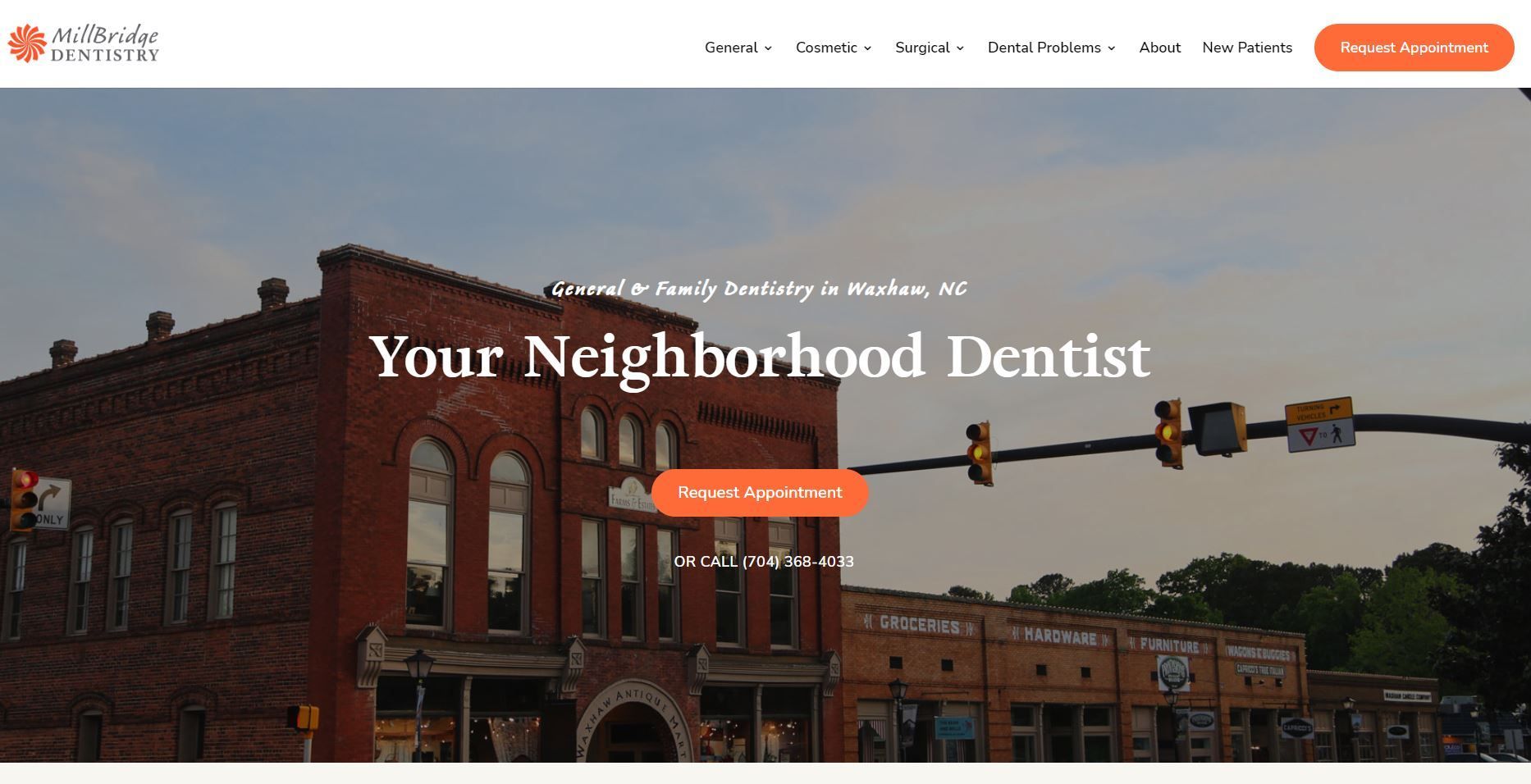
7. MillBridge Dentistry
MillBridge Dentistry uses a minimalistic web design that's eye-catching and outstanding. High quality photos, fun color schemes, and thoughtful icons make this website stand out.
Apart from visually appealing aesthetics, the MillBridge Dentistry website is easy to navigate and has compelling CTAs. The copy is also SEO-optimized and explains why they are different.
Overall, their design is very approachable and coupled with their copy, it shows that their practice is very welcoming to patients of all kinds.
Best practice:
- Tell potential patients why you are unique
- Highlight benefits to different types of patients
- Be thoughtful in how colors and icons open up your brand to be more welcoming and approachable
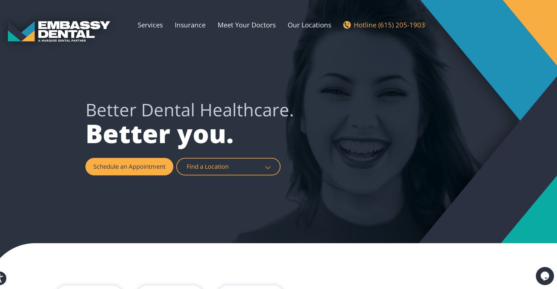
8. Embassy Dental
With dozens of dental clinics in the industry, standing out can be difficult. Embassy Dental has managed to break through the competition with a unique web design and navigation.
The website's sleek design makes it easy to identify where to learn more about a service, book an appointment, and choose a location. This streamlines the user experience.
Embassy's location page also contain the bulk of the information, as that where many of their local customers are most likely to land.
The creative use of icons also contributes to the site's overall appeal.
Best practice:
- Use content rich location pages if you are a multi-location dental practice
- Use a minimal homepage if you are multi-location
- Redirect users to their preferred location in a convenient and noticeable way
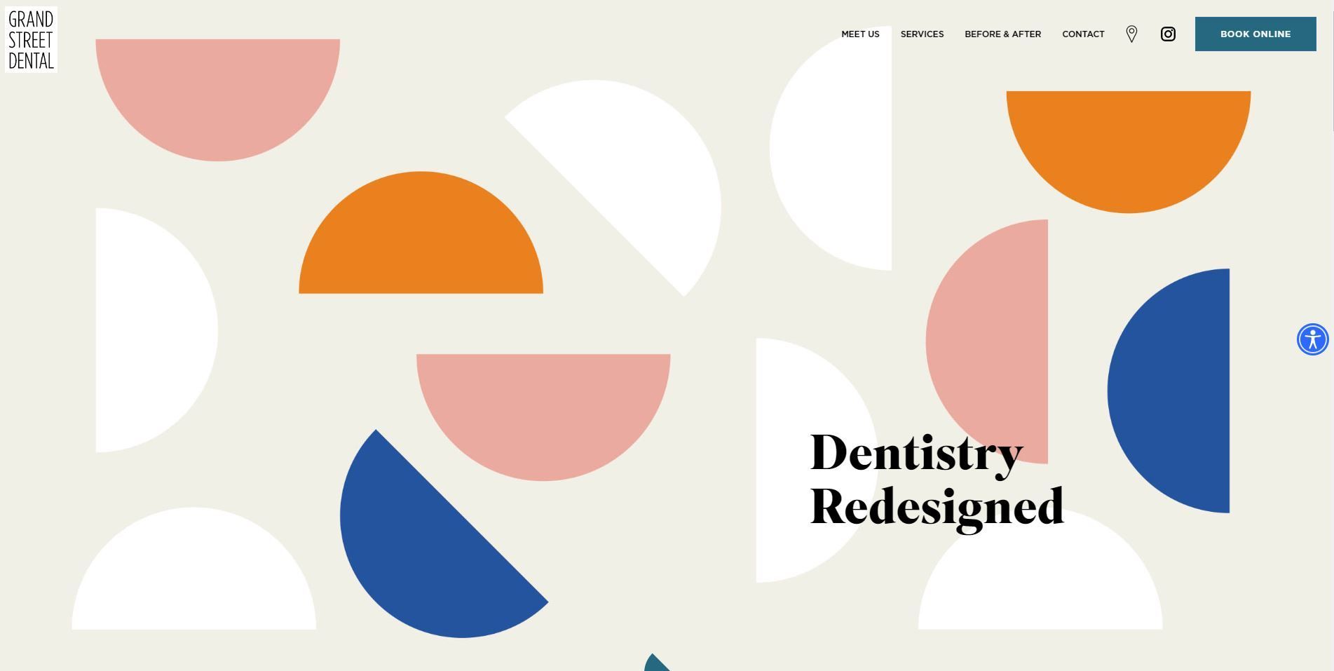
9. Grand Street Dental
Grand Street Dental is where to draw inspiration if you want a dental website with the vibe of a modern art gallery.
Visually appealing images, striking colors, and thoughtful icons engage people from the moment they land on the website. Their design is pretty hip and you can almost picture it's location just from the imagery and artsy aesthetic.
Beyond aesthetics, they don't dive too deep in on their services and content. Instead, Grand Street provides essential information that is easy to find and understand quickly.
Best practice:
- Use vibrant and artsy images to establish a trendy brand
- Write straightforward, essential content for a more to-the-point experience
- Highlight your visual social media sites, particularly Instagram
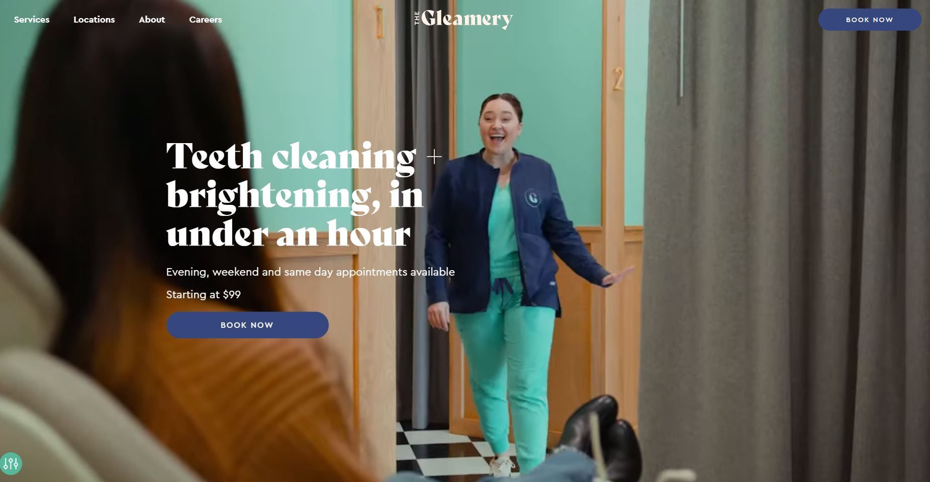
10. The Gleamery
The Gleamary makes a strong first impression with a short video, which gives people a glimpse of the practice's dental procedures and the variety of patients they have welcomed. The site engages web visitors with appealing fonts, images, colors and detailed copy.
Also important is that The Gleamery highlights a small but effective expectation that their services and pricing. This is just an extra push to help them seem more approachable to newer patients and eliminates one of the most common questions people have when it comes to any new service.
They are also further setting expectations by showcasing their reviews and how an appointment will play out when a visitor wants to engage.
Best practice:
- Set expectations for pricing and a typical appointment
- Include images of your practice
- Set expectations by providing and answering FAQs
Conclusion
Want to build an appealing dental website that gets consistent traffic and new patients? Tekkii can help translate "web" into revenue for your dental practice.
If you want an analysis and breakdown of your existing dental website, Contact us today to learn more.

Article by:

Looking to discover how you can improve your results from the web? Contact us to request a free consultation and we'll help you find out.
Recent Articles


Share This Article
Get the Latest
Subscribe for more digital marketing insights & tips to grow your business.
Leave A Comment